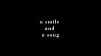
The title of the film - 'A smile and a song' gives a small image on what the film is about. In comparison to our title this one does not have the broad image than what actually happens in the story.

Setting and Location - The short that I have been researching into is set primarily within a church in a small village. The majority of footage is set within the confines of the church, that gives it a real essence of feeling and translates to the audience. Its a pictorious location and this has inspired our group to what we want to reflect from our own product.

Title font and style - The title font matches the genre, simple and effective and speaks to the viewer when visualised. The fonts used in this are different from the main title of their product, while we have decided to continue one style throughout to match the narrative of the film that we are using.
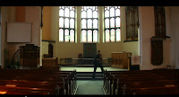
How the characters are introduced - The main character in the film (male) is first seen inside the church at a long shot showing his movement while moving over to the piano that is suggested in the opening title of the film. It is a well know camera technique for the drama genre as the audience can gather a feel for the setting in which has been chosen for the narrative.
 Costume - Seen in a medium close up the clothing that the characters are wearing are seen to be typical dress for a middle class father and young daughter in smart casual dress. The gentlemen in the shot is dressed in a smart jumper and checker shirt and is seen casual, but the colours are subtle and neutral and match the tone of the short.
 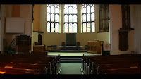 Genre and how the opening suggests it - This film is a drama telling the story of a mans loss of his daughter reflecting back on the memories that they have shared together. The opening shot shows inside the church at a long shot showing the surrounding area and giving us the audience a first person view of the location. We are not yet aware of what is going to happen in the narrative but we can tell that there is a connection with religion.

Camerawork - The cinematography that the director has used has helped me gather a greater knowledge on effective ways to show emotion and feeling of characters in particular genres of film. We have taken a lot of inspiration from camera techniques that are not generally used in the genre that we have chosen, therefore challenging current media conventions.
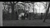
Editing - During the progression of this film we get to see a number of flashbacks to the past of this gentlemen and his daughter showing when she was alive through to the time she was in hospital with the illness that took her life. The use of black and white reflects the past, going back to the days when cameras used to shoot in black and white.
The title of the film - "How to say I love you" is a simple and effective title that immediately suggests the genre and what the story will be about. The two colours are minimal and inoffensive and gives the audience a suggestion of calmness.

No comments:
Post a Comment