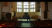
The link below is the final edit of "Rejected". From the audience feedback (common criticisms made by our audience) that we have received we have made any of the changes necessary then added to YouTube. Some of the changes that have been made are, the re-recorded narrative and added any shots that spoiled the continuity of the footage.
Media A2 Scott Lancaster
Wednesday, 4 May 2011
Sunday, 1 May 2011
'How did you use new media technologies in the construction and research, planning and evaluation stages?'
In the production of "Rejected" we have used a number of new media technologies to enhance viewing and the overall quality of our production. Today we have variety of low cost, professional equipment and editing software that gives us the ability to produce exceptional work.
Digital Camera.
The first use of technology was the camera we used, a Fujifilm Finepix S1600. Today you can buy digital cameras like this that can record videos with high quality playback. The particular camera we used has High Definition (HD) video recording, which has a high quality image.
Compared to a conventional Digital Video (DV) camera a HD record camera allows for sharper exposure and higher quality images, compared to more grainy footage from a DV camera.
The compact design meant that transportation was easier and all the functions are easy to use and work. Another advantage to the size was the shots that we have used to portray our main character (Luke) allowing us to work closely in tighter areas that larger video cameras may not be as accessible.
Adobe Premiere.
When all our shots were collected it was then time to edit the footage using Adobe Premiere. This software is highly intuitive and simple to use after some level of practice. For the correct continuity and the smoothness of transitions, Premiere allows us to cut shots and add any effects that will improve the quality of viewing.
 Crop Tool - The initial beginning the creation of our poster was to crop down to a size most recognised for a conventional poster on the high street. Emphasis has been paid on the main character of the film and we wanted the character to be in dead centre of the page. Another factor we wanted to consider was to create an enigma to the potential audience, including the font title, the reasoning the church in the background and the posture and emotions of the main character for the narrative.
 Type Tool - We wanted to follow a consistent font across the main product and the poster. The font we have used is Lithos Pro, a traditional rather unforgiving style of font. It really matches the narrative of our film with the use of the church.
Digital Camera.
The first use of technology was the camera we used, a Fujifilm Finepix S1600. Today you can buy digital cameras like this that can record videos with high quality playback. The particular camera we used has High Definition (HD) video recording, which has a high quality image.
Compared to a conventional Digital Video (DV) camera a HD record camera allows for sharper exposure and higher quality images, compared to more grainy footage from a DV camera.
The compact design meant that transportation was easier and all the functions are easy to use and work. Another advantage to the size was the shots that we have used to portray our main character (Luke) allowing us to work closely in tighter areas that larger video cameras may not be as accessible.
Adobe Premiere.
When all our shots were collected it was then time to edit the footage using Adobe Premiere. This software is highly intuitive and simple to use after some level of practice. For the correct continuity and the smoothness of transitions, Premiere allows us to cut shots and add any effects that will improve the quality of viewing.
The programme being easy to use means that the quality of footage has been greatly improved. When audience feedback was gathered we could make any changes easily if the editing was not smooth or any changes to the music may have been needed. For example a main chunk of our film is a voiceover by Luke, telling the audience his story. From the audience feedback a number of people analysing the footage told us that the voiceover was "crackling" and "you could hear background noises" that were "distracting". Once this was rectified we could simply remove the previous soundtrack and replace with the new updated version.
Garageband.
Exclusive to the MAC computers in our editing suite is a programme called GarageBand, that allows you to produce and compose music. For a more connected product we decided to produce our own movie tracks rather than using copyright free music. GarageBand uses realistic instruments, that can be used to produce tracks perfectly suited to our genre and creating the correct emphasis to our target audience.
Garageband has been a great software tool in the production of our film. It has been efficient and relatively easy to use. Once browsing the different tools in the software I have been able to create a track to match the genre of our production. We decided to create our own music track as we could not find one to compliment the style of film that we was creating and also we wanted to avoid copyright sound.
Garageband has a range of instruments and beats offered to the consumer that can be weaved together to create the perfect track. On the other hand we could use itunes to add sound effects that we needed in the background to add to the emphasis that we wanted to create.
Adobe Photoshop CS3.
For our ancillary task we were asked to create a poster for our final product, showing what the product is about to our target audience. Photoshop is the perfecting software to use to create a poster for our production, the tools are easy to use.
Using new media technology for our poster allows use to make any changes once receiving audience feedback. Around 20 to 30 years ago posters would have been created by hand, so if a problem occurred it would most probably would have had to be scrapped and started again.
 Crop Tool - The initial beginning the creation of our poster was to crop down to a size most recognised for a conventional poster on the high street. Emphasis has been paid on the main character of the film and we wanted the character to be in dead centre of the page. Another factor we wanted to consider was to create an enigma to the potential audience, including the font title, the reasoning the church in the background and the posture and emotions of the main character for the narrative.
  Type Tool - We wanted to follow a consistent font across the main product and the poster. The font we have used is Lithos Pro, a traditional rather unforgiving style of font. It really matches the narrative of our film with the use of the church.
 Magazine Review Page.
The second ancillary task we had to complete was a magazine film review demonstrating our film in the public domain. For this particular piece I used Microsoft Office Publisher 2007 which is a proven software tool for amateurs and professionals to create items from posters, to flyers, to business cards.
Social Networking - YouTube/Facebook.
In 2005 a phenomena occurred in the form of online video streaming known as YouTube. Visited by millions of users from across the world daily this is the perfect place to launch our final product for feedback and a form of distribution into the public eye.
Another form of social networking that can be used to preview our footage is Facebook. Introduced in 2004 there is an estimate of over 600 million users in 2011. There is the ability to add the poster, magazine and even link the footage onto Facebook where your friends have the ability to comment and for the product to become commercially known not just in the local area but worldwide.
Social Networking - Twitter.
A relatively new form of social networking (new media technology) is Twitter founded in 2006 and has an estimate of 200 million users including celebrities and companies.
While tweeting recently I received additional followers that are similar to me to other people/businesses that I followed. As this is relatively new technology all the big companies are joining in order to leave latest updates of new products that they have introduced. For example Fox Searchlight (a division of Fox Filmed Entertainment) specialise in independent films most recognised as Slumdog Millionnaire and The Full Monty.
Currently Fox Searchlight have just under 150,000 followers that allows them to gather regular updates from the production company that means the audience is up to date with new enhancements from the products.
Blogger.
For the creation of our coursework we have used another form of new media technology in order to note the progression of our product through to the end. The software is simple, easy to read and well informed to give amateur (like myself) to use new tools to enhance the view ability of my blog.
Blogger is an effective tool for promoting new products such as "Rejected". Blogger is used throughout the world daily, it allows for the product to become known across the world in small numbers. Blogger is also effective as comments can be left from the different posts that I have added. For example last year our coursework was produced on Blogger and teacher would leave us comments on what we could do to enhance the quality of work from individual posts.
Looking for the future! (New Media Technology).
Currently permitted in the United States, Warner Brothers has released 'video on demand' using social networking site www.facebook.com. This new enhancement allows Warner Brothers to upload and allow access to large Hollywood films can now be viewed online with the 600 million users on Facebook to date. One of the first films that Warner Brothers will be using is the 'The Dark Knight' that has grossed over One Billion US dollars and been shown within 6735 screens across the world.
Soon to be introduced is 'video on demand' to Iphone users allowing customers to access films during daily commutes to work or while on holiday meaning they are up to date with huge blockbusters. Once our film becomes known to the public we could use this form of technology as a way of having accessible films where ever the consumer may be. For example with access to films away from the television and cinema films can be watched during commutes to work and school (on the train). It would also be a great resource during holidays while relaxing.
What have I learnt?
I personally was fully aware of new media technology in society and have access and use these forms of new media technology in daily life. I have however learnt the different conventions and how these forms are used by different people and companies and how they are actually used as a promotional tool to advertise productions. It was a huge learning curve for me as I did not realise how production companies and other businesses of all types use social networking as a key advertisement for their latest releases, I somewhat took for granted how popular these sites were as I use them regularly and has become second nature use for keeping in contact with family and friends.
'How effective is the combination of your main product and ancillary tasks?'
Location -
The key image that we wanted to show in our product was 'Religion' and 'Homosexuality' in British society. During our brainstorming session we decided the perfect location to film would be in a small town or village that has quant historic homes and a small church that residents visit every Sunday. During filming we used two primary locations, the town of Sandwich and the village of Minster. Both fill the criteria for being historic, quant, quiet and beautiful.
For the two ancillary tasks, we have used location and setting to create an enigma. For the poster we wanted to show suggestion of the main character and the church into a stylised image that communicated with our target audience.
The picture used for the poster was taken in the winter months of January when the trees were bare, days were short and the weather was cold. This really accentuates the feeling of unhappiness, desperation and rejection. The colours used are typical of what is seen in this type of genre, it is not supposed to be colourful and this would challenge and foul the story that we are trying to portray.
Existing film poster research -
 To gather inspiration and ideas for our own product I had researched in to other posters used to promote new films in the market. Here in the performing arts department at school we have a range of posters displayed around the buildings. One of the outstanding posters that had taken the eye was "Platoon" by Hemdale Film. Although this is not the genre we are using for our film we decided that this was the type of layout that we wanted to use for a professional finish.
This poster uses a vivid palette of colours giving an explosion of thoughts. The colours used to promote the film are very natural to the main narrative of the film. Using green as the majority of the poster allows for a setting to be produced from the palm trees through to the camouflage on the troops clothing. The soldier that is kneeing on the grass with his arms held high and his head looking into the sky is seen in the middle of the poster at a medium close up.
We have taken inspiration by the text layout of this poster a fairly traditional layout that symbolises the soldier on his knees. This is what we have done with our own poster to make connotations of what our film narrative is about. However the main reason this film poster has been used it to the text layout used at the bottom of the poster which we would like to replicate.
The pure simplicity of "Never Let Me Go" symbolises how the company has matched the poster design with the genre (Romantic Drama). The poster has real emotion and moves to the reader and the minimalist tone that shouts out character and actually shows deep meaning.
The Pier -
 The use of an extreme long shot to the end of the pier suggests there is no where to run, all that is beyond the protective fencing is hundreds of miles of ocean. The pier is seen at dead centre of the shot and shows its significance in the film and shows the wonderful British architecture once seen at Britain's coastal towns, in this instance Clevedon Pier, Somerset. One shot that really shows essence of the "no where to run" is the wooden floor running down to the pier building, as the floor goes into the distance (as seen in dead centre) you can see it curving into the centre point of the page where it is actually narrowing.
The sky shows representation of the genre and is a convention that is common throughout film posters that I have seen throughout my media studies course. Around three quarters of the sky is overcast and grey which suggests the negativity and possible downturn of the narrative.
Magazine Review.
The production of my magazine review was on Microsoft Office Publisher 2007 which is a very easy program to operate. From the research into existing magazine reviews we decided that our film shall be marketed under an independent film magazine due to the challenging nature of our film narrative, which was inspired by directors such as Ken Loach (Sweet Sixteen) and Andrea Arnold (Fishtank).
Audience Feedback -
A critical part of our work was audience feedback in which we used new media technology to gather information regarding our final product and rough cut in order to make any changes that have been flagged up by viewers. We also used more traditional techniques that included asking piers in our class as we could have a more in depth conversation on the positive and negative views that they may have of "Rejected".
How significant was audience feedback?
It was a highly significant that we received audience feedback for the main products and ancillary tasks. In order to gather some audience feedback we used new media technology such as social networking sites as Facebook and video streaming sites such as YouTube.
The first step of analysis that we took was added our rough cut onto YouTube to gather views and feedback from viewers from across the world. Below are a number of comments received from the different sources that we have used;
The key image that we wanted to show in our product was 'Religion' and 'Homosexuality' in British society. During our brainstorming session we decided the perfect location to film would be in a small town or village that has quant historic homes and a small church that residents visit every Sunday. During filming we used two primary locations, the town of Sandwich and the village of Minster. Both fill the criteria for being historic, quant, quiet and beautiful.
For the two ancillary tasks, we have used location and setting to create an enigma. For the poster we wanted to show suggestion of the main character and the church into a stylised image that communicated with our target audience.
The picture used for the poster was taken in the winter months of January when the trees were bare, days were short and the weather was cold. This really accentuates the feeling of unhappiness, desperation and rejection. The colours used are typical of what is seen in this type of genre, it is not supposed to be colourful and this would challenge and foul the story that we are trying to portray.
Existing film poster research -
 To gather inspiration and ideas for our own product I had researched in to other posters used to promote new films in the market. Here in the performing arts department at school we have a range of posters displayed around the buildings. One of the outstanding posters that had taken the eye was "Platoon" by Hemdale Film. Although this is not the genre we are using for our film we decided that this was the type of layout that we wanted to use for a professional finish.
This poster uses a vivid palette of colours giving an explosion of thoughts. The colours used to promote the film are very natural to the main narrative of the film. Using green as the majority of the poster allows for a setting to be produced from the palm trees through to the camouflage on the troops clothing. The soldier that is kneeing on the grass with his arms held high and his head looking into the sky is seen in the middle of the poster at a medium close up.
We have taken inspiration by the text layout of this poster a fairly traditional layout that symbolises the soldier on his knees. This is what we have done with our own poster to make connotations of what our film narrative is about. However the main reason this film poster has been used it to the text layout used at the bottom of the poster which we would like to replicate.
The pure simplicity of "Never Let Me Go" symbolises how the company has matched the poster design with the genre (Romantic Drama). The poster has real emotion and moves to the reader and the minimalist tone that shouts out character and actually shows deep meaning.
The Pier -
The sky shows representation of the genre and is a convention that is common throughout film posters that I have seen throughout my media studies course. Around three quarters of the sky is overcast and grey which suggests the negativity and possible downturn of the narrative.
Magazine Review.
The production of my magazine review was on Microsoft Office Publisher 2007 which is a very easy program to operate. From the research into existing magazine reviews we decided that our film shall be marketed under an independent film magazine due to the challenging nature of our film narrative, which was inspired by directors such as Ken Loach (Sweet Sixteen) and Andrea Arnold (Fishtank).
Audience Feedback -
A critical part of our work was audience feedback in which we used new media technology to gather information regarding our final product and rough cut in order to make any changes that have been flagged up by viewers. We also used more traditional techniques that included asking piers in our class as we could have a more in depth conversation on the positive and negative views that they may have of "Rejected".
How significant was audience feedback?
It was a highly significant that we received audience feedback for the main products and ancillary tasks. In order to gather some audience feedback we used new media technology such as social networking sites as Facebook and video streaming sites such as YouTube.
The first step of analysis that we took was added our rough cut onto YouTube to gather views and feedback from viewers from across the world. Below are a number of comments received from the different sources that we have used;
- The voiceover narrative used in the footage needs reproducing as the sound quality is not at a professional standard. The sound appears crackly and can hear background noises that are distracting.
- The voiceover script compliments the footage correctly, matching the genre and the instruments used in the earlier and later sequences.
- The opening shots of the film are very tranquil and peaceful and is reflected to painting produced by landscape artist Thomas Gainsborough.
- Cinematography used is not just common and conventional shots usually seen within television and film. In particular to close up and body shot of the main character ringing his hands and being able to visualise the characters emotions through posture and facial expressions.
'In what ways does your media product use, develop or challenge forms and conventions of real media products?' (Part Two)
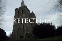 The title of the film - 'Rejected' sums up the films narrative and is used for an enigma to the audience. We used the church in the background to give a subtle meaning of the film and why the use of the word 'Rejected' is used with the church in the background.
 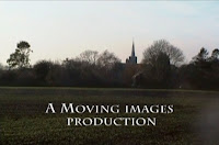 Setting and Location - Setting and Location is used throughout the opening shots of our film in order to give an essence of where and what is connected with village life. We decided to use an extreme long shot to show the village of Minster, Kent, and how peaceful, tranquil and beautiful the location of the village is. As a group we decided that a rural location was ideal and most connected with Religion with villagers attending church ever Sunday. It does not give away the narrative of the homosexuality in not accepted in religion.
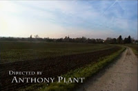 Title font and style - The text that we have used throughout the footage is traditional and not garish in its colour. Sticking particularly with white as this is seem as a Holy, pure and inoffensive colour. Attention to detail has been paid for the quality of viewing and wanted to challenge the overall image that was shown in the opening sequence of the film. The font used is Lithos Pro, which is a medieval/stone style font matching the church architecture, continuing with the image of religion.
 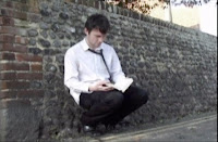 How characters are introduced - Our main character, Luke (Liam Philpott) gains prevalence throughout the product, and the opening shot shows him in a medium close up showing his posture, emotion and costume. Although dressed in formal clothing, and connects the stereotype of a typical 'Church goer', the clothing is laid out informally and scruffy, with the top button open, tie loosened and shirt untucked. Immediately we can see him clutching the bible and crouching down by the church wall showing the audience his saddened emotion and vulnerability while in his state of emotion.
 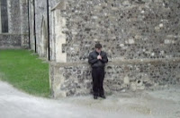 Costume - Question a member of the public about a teenagers stereotyped dress sense, they would likely say 'track suit bottoms, trainers and a base ball cap'. We have challenged this convention as Luke is a devoted Catholic and this is shown with the costume that he is wearing. Luke is seen dressed formally, wearing shoes, trousers, shirt and tie that is more professional and does not have the same negative image of teenagers in todays society.
 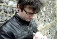 Genre and how the opening suggests it - Rejected is a Romantic Drama following the life of one teenagers challenge of sexuality in his particular religion, Catholicism. Luke is shown in a medium close up, leant against the church wall looking apprehensive, lost and wondering in a sea of thoughts. His hands are clenched together that add to this image and he is looking down to the floor while gathering his thoughts.
 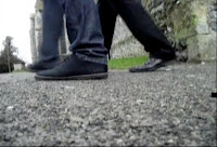 Camerawork - The use of cinematography helps evidence our narrative to the audience, by using a range of techniques to show posture, location and costume. Luke has prevalence in our film so we have mainly used close ups and medium close ups to show his story and is generally used in other romantic dramas that we have watched as part of our research into Romantic Dramas.
 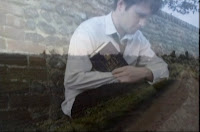 Editing - To match the relaxed, calming footage of our film we wanted smooth transitions and effects to suggest this. This is not an action film so we wanted fluidity and smoothness as a key priority of our aims. Although this is a 'drama' is does not have large, distracting transitions to pull the viewer away from what the voiceover is telling and to gather a grasp of what the story is about.
 'In what ways does your media product use, develop or challenge forms and conventions of real media products?' (Part One)
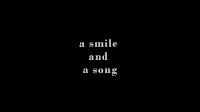
The title of the film - 'A smile and a song' gives a small image on what the film is about. In comparison to our title this one does not have the broad image than what actually happens in the story.
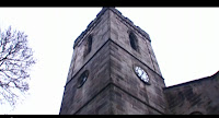
Setting and Location - The short that I have been researching into is set primarily within a church in a small village. The majority of footage is set within the confines of the church, that gives it a real essence of feeling and translates to the audience. Its a pictorious location and this has inspired our group to what we want to reflect from our own product.
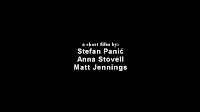
Title font and style - The title font matches the genre, simple and effective and speaks to the viewer when visualised. The fonts used in this are different from the main title of their product, while we have decided to continue one style throughout to match the narrative of the film that we are using.
How the characters are introduced - The main character in the film (male) is first seen inside the church at a long shot showing his movement while moving over to the piano that is suggested in the opening title of the film. It is a well know camera technique for the drama genre as the audience can gather a feel for the setting in which has been chosen for the narrative.
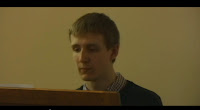 Costume - Seen in a medium close up the clothing that the characters are wearing are seen to be typical dress for a middle class father and young daughter in smart casual dress. The gentlemen in the shot is dressed in a smart jumper and checker shirt and is seen casual, but the colours are subtle and neutral and match the tone of the short.
 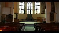 Genre and how the opening suggests it - This film is a drama telling the story of a mans loss of his daughter reflecting back on the memories that they have shared together. The opening shot shows inside the church at a long shot showing the surrounding area and giving us the audience a first person view of the location. We are not yet aware of what is going to happen in the narrative but we can tell that there is a connection with religion.
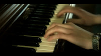
Camerawork - The cinematography that the director has used has helped me gather a greater knowledge on effective ways to show emotion and feeling of characters in particular genres of film. We have taken a lot of inspiration from camera techniques that are not generally used in the genre that we have chosen, therefore challenging current media conventions.
Editing - During the progression of this film we get to see a number of flashbacks to the past of this gentlemen and his daughter showing when she was alive through to the time she was in hospital with the illness that took her life. The use of black and white reflects the past, going back to the days when cameras used to shoot in black and white.
The title of the film - "How to say I love you" is a simple and effective title that immediately suggests the genre and what the story will be about. The two colours are minimal and inoffensive and gives the audience a suggestion of calmness.
Magazine Review Page
As part of the ancillary tasks we are asked to create a magazine review page. In order to gather a feel for what magazines reviews are doing to address films to readers, I needed to do research into other products that are on the market today. There are big institutions such as Empire Magazine, BFI Sight & Sound and Total Film that promote large, box office films that is the ideal starting point for the research. It will help me gather information on layout, font, images and the content that is used throughout, to help create a professional finish.
On the Empire website the company have added example pages from the magazines that they print. It has helped me gather the necessary information on how magazine reviews are made up.
On the Empire website the company have added example pages from the magazines that they print. It has helped me gather the necessary information on how magazine reviews are made up.
Image sourced - http://www.empireonline.com/magazine/
While gathering research into my genre I had gained some difficulty in finding magazine reviews for a romantic drama as challenging as our topic. However I have found a number of magazine reviews for large Hollywood blockbusters. Although the genres are different to ours, magazine conventions are very similar in their layout which is the key for the success of the magazine review that I am going to create.
Existing magazine reviews.
For demonstration purposes I have used this particular example for my magazine review page. The magazine review page uses a number of conventions that are generally used in the industry to give a professional, informative and easy of use spread in production and in terms of view ability for the audience.
Immediately apparent is the image used on the two page spread here that is used. Showing emphasis of the two main characters portrayed in the film. An image in the review generally helps sell the product as a unique selling point (USP) is the actors starring in the film. If a famous actor is used in a film people may want to watch it because of this very reason. However as our actors are unknown (as are actors in most independent films) adding an image will certainly show Mise En Scene (costume) and an actual introduction of our actor (Liam Philpott).
My Magazine Review - Rejected.
In the production of my magazine review ive decided to stick to the general conventions of films review pages. As this is an independent film I have decided that the film review should be held over one page rather than the two page spread that would generally be seen with larger, blockbuster films.
Wednesday, 6 April 2011
Audience Feedback
Rejected Analysis
In order to successfully gather analysis I enlisted the help of piers/teachers and the use of new media technology to allow for feedback to help improve our product.
In order to successfully gather analysis I enlisted the help of piers/teachers and the use of new media technology to allow for feedback to help improve our product.
Word Cloud created using "Wordle" - http://www.wordle.net/
Monday, 4 April 2011
Film Scripture - Rejected.
Media Script – Rejected
Liam: how did I end up like this? Well, my names Luke and this is my story. It all began last week
Liam: I had allot on my mind, being at church was one of the few places I’d felt accepted.
Liam: but would they have really accepted me if they knew my secret? I didn’t know.
Liam: no one else knew, it was tearing me up inside –
Liam: I didn’t know whether to tell anybody, I had friends, people I thought I could trust.
Liam: yet it was freezing cold but I couldn’t build up the confidence to go inside and face them.
Liam: I wanted to be alone, but Scott found me, he was one of my closest friends. We had known each other for years.
Liam: He could tell something was wrong, that I was unhappy. He talked to me, he tried to comfort me. He gave me the confidence I needed.
Liam: he was being a friend; I thought I could trust him and that he could know my secret. So I did, I told him.
Liam: looking back I should have know he wouldn’t accept me. It was the wrong thing to do, I shouldn’t have told him.
Liam: so there I was, alone, left out in the cold. Rejected by everyone, everyone I thought I could trust. I had nowhere to go, no purpose in life. I had lost everything, everyone who I thought cared about me.
Liam: Ever since I was young, I knew I was different but I knew I had to hide it, to be able to fit in amongst everyone I grew up with.
Liam: I was always a strong believer in the bible; I lived by its laws and values, having grown up in a strong Catholic family.
Liam: All I can do now is walk away from everything I’ve ever known, to find somewhere I can fit in and be myself, but for now I don’t know where to go or who to trust.
Wednesday, 30 March 2011
Ancillery Tasks.
Poster
In order to publicly introduce our film we created a posters using Adobe Photoshop CS3 which is an easy to use programme to create an effective poster. From the research I have done prior to the creating this poster many of the film posters used read a minimal amount of information and give a small insight to what the product is about.
In the three film posters that I have reviewed below there is always a key figure/location that gives a small insight and creates an enigma for the audience when viewed. For example while viewing and reading the Charlie St. Cloud poster I was intrigued why the use of the small fishing scene was used.
The key emphasis of our film is the church and religion which allowed us to use Minster church as one of the main figures in our poster. Minster Church is steeped in history and character
How we made the soundtrack.
The soundtracks we have decided to use in our film have been created from a blank canvas, using one of the programmes that we have access to in the performing arts department of our school. It has a number of instruments and tunes that can be threaded together in order to make a suitable track for whatever genre your film may be.
For the opening of "Rejected" the mood appears blissful, joyful and happy with landscape shots of a small rural village in Kent, England. We decided when creating the track that it would be ideal to have the more blissful feel as we want to show the location for all its beauty before the main storyline began.
For the opening of "Rejected" the mood appears blissful, joyful and happy with landscape shots of a small rural village in Kent, England. We decided when creating the track that it would be ideal to have the more blissful feel as we want to show the location for all its beauty before the main storyline began.
Wednesday, 19 January 2011
Sound Analysis
As we a group we cannot emphasize the importance of sound that we will use throughout our film. The overall effect of the film will be down the music and sound that we use to express the narrative and genre of the film that we are using.
As a Technology school we have assess to technologically advanced equipment that means we can create our own music and sound. It has come to our belief that we are only allowed to use 10% copyright sound in our film as we do not own the rights to stream the music online through motion images.
Here at Sandwich Technology School we have a strong Performing Arts department as are renouned for the talent of the students in the school. With any productions produced at the school it must go through editing in order to create the final product. There we have assess to many different sound that will compliment any of the film genres that are created under the school.
On the other hand we have access to copyright free soundtracks that can purchased on the internet for a very little cost that can completely transform your film sequence. We have access to millions of tracks that can purchased with the click of a button and downloaded in the matter of seconds. These websites have specific genres ranging from song tracks all the way to sound effects ranging from different lengths and pitches depending on which genre you are looking at.
While searching through the many different sites that I have access to I discovered a website called http://www.audionetwork.com/sound-effects/, their website consists of global sounds which will be instantly recognisable across the globe. Prices for 3 minute tracks can be as little as 79 pence.
The media department has access to a number of iMAC computers that offer a number of different programs to enhance viewers opinion for the budding film maker. One of the programs that has helped transform our production is GarageBand 3 which is essentially a sound/music creator program.
Monday, 17 January 2011
Production Company.
As part of our AS Media Studies we was asking to create a short film addressing a horror genre, to advertise our film we were asked to create our own production company which we named "Scythe Productions". After a great deal of discussion we came to the conclusion that this would be inappropriate for a romantic drama style of film.
As a group we decided not to rename our production as a specialist title as this would limit the style of films that we create in the future, we want to gain a universal appeal for all audiences to enjoy. Initially we gave ourself a day to think and brainstorm a number of titles that we thought would have "universal" appeal, a short list is detailed below.
As a group we decided not to rename our production as a specialist title as this would limit the style of films that we create in the future, we want to gain a universal appeal for all audiences to enjoy. Initially we gave ourself a day to think and brainstorm a number of titles that we thought would have "universal" appeal, a short list is detailed below.
- The Convent - A quick and snappy idea was "The Convent", as our narrative is based around a nunnery we thought this would be ideal thus the title. However our main aim was to create universal appeal and decided that it was too specialised and would not be correct for other short films that we create in the future.
- Loved Up - Appears to be a specialist genre title as it denotes a romantic genre and image. If in the future we decide to create a new film with a different genre this name would certainly not be suitable. If for example we decided and planned to create an Action movie, the production company Loved Up completely clashes the with the difference in genres.
- Kent Entertainment - Living in Kent we thought this would be a good but not solid title for our production company, after researching into the name we discovered that it is an existing company specialising as a directory for entertainment in areas located around Kent.
- Thanet Films - As with Kent Entertainment, "Thanet Films" is a based on our localised heritage. It is also an existing company that is known as the Thanet Film Society where you can gather details on films showing in the area. Also Thanet Films does not have instant gratification as it is not eye catching or imaginative in its wording.
After a week of hard grafting we decided to call our production company "Moving Images", from market research we have discovered that no production company had this name and it houses an immediately recognisable and desirable title. I believe that "Moving Images" provides a stable holding for the production company in the future and does not have the limitations of the others that we brainstormed earlier. "Moving Images" is modern, subtle and inoffensive in its wording and is essentially the basis of a film using moving images to portray characters and narrative.
Disruptions to Filming.
Adverse Weather Conditions.
As has been widely aware no only in the UK but across Europe and other continents the snow of December 2010 had caused major disruption to the running of everyday life. Here in Kent, England we also suffered from the adverse weather conditions of Scotland and Northern England. This caused havoc for our media studies filming date as the snow was not suitable for the style of film that we are portraying.
As has been widely aware no only in the UK but across Europe and other continents the snow of December 2010 had caused major disruption to the running of everyday life. Here in Kent, England we also suffered from the adverse weather conditions of Scotland and Northern England. This caused havoc for our media studies filming date as the snow was not suitable for the style of film that we are portraying.
Scene of Edinburgh, Scotland at the beginning of December 2010.
The snow at the end of 2010 caused massive disruption to public travel, our group members live in different locations in the Thanet area. Any travel was difficult and potentially dangerous as we were advised not to travel, especially into rural areas that are not prepared for these weather conditions. One of our group members, Liam, lives in Minster Kent which was our film location but it was inaccessible for Anthony and I as the roads and rail were too dangerous to travel. I myself lives one and half miles from Minster but rural roads even by foot would have been potentially dangerous due to black ice and other motorists that have tried to commute to work or home.
With the shifting and unpredictable weather conditions it would not be advisory for our group to commence shooting as this could be a huge problem when considering the continuity. For example, if one day we began by shooting the film within two days and we need to add any cuts at a later date, snow patterns can be different or thawed completely. Our only option was to suspend filming to a later date when the snow had thawed, it however gave us a huge opportunity of making touches perfect in our storyboard and research that we had to undertake.
Actors.
One major setback for our filming was the actors that we wanted to use in our film, we have all arranged the characters and were ready to begin shooting. However one member of our had to be called away due to her husband falling ill. This then resulted in (Ethel) to be unavailable for some time which meant we needed to create a contingency plan in order to continue filming.
In order to do this we opened out our storyboard and began scanning through our frames noting where the character (Ethel's) main shots were to make any changes with shots, editing and time. After a meeting with our teacher we discussed that a new aspect will need to be put forward in order for the continuation of the filming and editing. The changes are enlisted below;
Character Replacement.
After a large discussion with my teacher and group we decided that due to these reasons that the narrative should be changed and adapted in order for us to be able to complete it successfully. We found it difficult to replace the character of Ethel which lead the group into drastic measures, we intially asked people of our age group if they would be happy to portray the character of Ethel, but however this would have a dramatic effect on the realism of the film.
In a real life situation we do not see Nuns in the age group of 17/18. It would be a major problem that we needed to address. The best solution was to change the characters and make minor touches to the storyboard, we still wanted to follow on the same lines of the original script to portray the character in hardship and how homosexuality is unaccepted in certain churches.
We decided to replace the Female characters with Male characters as this would be a much easier venture. As a group we were made up of three Male characters. We could easily change the narrative to suit the genre of the original work by scrapping Nuns into a highly religious man who mistakenly opens his true feelings to a fellow friend.
Monday, 22 November 2010
Film Release in the UK Box Office
It was never our intention on creating a widely saturated release and it has never been our beliefs to have a blockbuster. As a group we believe that our style of film will have an unsaturated release because it will not be for every audience.
We believe that we have created a new and imaginative style of film where our audiences will have to think about the plot as they are watching it ... it was our priority to create an enigma throughout the narrative in order to connect and interact with the audience. It came to our attention that interaction with the audience would play a key part in visual pleasure and by adding these smalls twists to the narrative will help with this.
Although other romantic dramas that have been produced have been a huge hit globally, our challenging narrative will some what be a complete change to what the audience would expect from a romantic drama. Films such as Love Actually (2003) that had widely saturated release is one of the most satisfying, warming and pleasurable British films that has ever been produced. IMDB states that Love Actually grossed $244,931, 766 (US dollars) in May 2004 showing how popular British romantic dramas are. One of the main reasons for this is down to their actors most recognisable in Love Actually would be Colin Firth, Hugh Grant and Bill Nighy this gives the film an instant gratification which speaks for itself in the figures that the film created.
The group and I believe that "A Monks Tale. Thou Shalt Not Love" will be most popular on the internet using video streaming sites such as YouTube. The internet is a powerful source of information, it was estimated that 1.9 billion people across the globe had use of the internet. This represents in June 2010, 28.7% of the world population. Today in the 21st Century internet streaming is the best form of advertising new talent, it is free, quick and easy to use.
Introduced in February 2005, YouTube receives millions of video views per day, a year later in the summer of 2006 is was announced that 65,000 videos were uploaded per day and were receiving 100 million views per day. This shows how popular this site is, even from its launch date in 2005 is was a massive phenomenon of technology and the way we watch videos.
This is why we believe that uploading our video on YouTube would be an ideal way of our film being discovered by the population, the public accessing the site will be able to stream our video in the matter of seconds and have the ability to comment on how they feel about the video itself.
Our Actors
For the direction of the film we need strong actors who can help progress the narrative fluidly and correctly. As a group we had put a great deal of consideration into the actors that we wanted to use. Initially our idea was to act ourselves but we do not believe that we are professional enough to do so. Another thought would be that the originality and overall finish would be dampened due to this, while brainstorming tirelessly we came to a conclusion .. we need to employ actors.
People who know us personally can see this through the narrative, the audience will know our personality. This is not correct for our media piece as our personalities are completely different to how we want it to appear in our film. Thus coming to the conclusion that we need actors who our audience will not know. The viewing pleasure will be greatly improved by this very reason.
Our proposed plan is to have two nuns starring in our work, one to play Margaret and the other to play Ethel. Margaret as a main character we want her to be around late 40s to early 50s as this is still as suitable age for our romantic drama to seem relevant and true. Ethel (Head Nun) should be a little older (possibly 60 years and above) which will show authority and more experience and greatly knowledgeable. Our last character is a traditional English monk named Ted, we wish this gentlemen to be similar age to Margaret in order to create a perfect veneer between the characters.
Equipment and Technologies
Of course the film industry is one of the most technologically advanced industries in the world, using huge, expensive equipment in order to create the perfect film. Although their equipment is out of our range, we are able to use new technologies sold today which can create good and strong images.
Camcorder.
Today retail stores nationally sell relatively low priced camcorders that can be used by any amateur film makers, new advancing in technology means that low price camera equipment can be bought with HD ready function which enhances picture quality. Its proven technology and immaculate results can be generated from a specialist film maker to anyone who is new to film making.
The camera in house at school are small handy cams that are easy to use and have all the functions you need to create an adequate film.
Tri-pod.
A tri-pod is a wonderful piece of engineering, such a simple device can completely transform the overall finish of a film by creating smooth professional frames. Our film requires smooth flowing frames to add a sense of realism, the film is not going fast beat because of the style that we want create.
An unsteady camera can look documentary style which is the complete opposite of the finish that we want to place in our shots, we want this to look as authentic as we can and can be easily achieved with the use of this device.
Tuesday, 16 November 2010
Tutorial
Photography Lesson 1
As part of our work we need to know how to work a complex SLR (Single Lens Reflex) camera effectively in order to create the perfect shots that we want. Although this was a good lesson I was very aware on the use of an SLR camera which meant it was somewhat a refresher course for me personally. SLR cameras can be used for a variety of functions which helps create precision, fluidity and confidence for the photographer. An SLR camera can be used to focus and zoom manually that allows you to create the perfect image and a number of functions that allows you to change the overall experience of uses that you require. A handy function is that shutter speed can be adjusted to suit the conditions of the location of image, they are very sensitive to movement which means it takes some time to perfect the images as they can be seen to be blurry and unstable in many occasions.
As part of our practical lesson we created a number of varied shots allowing me to create different images through shutter speed, depth of field and zoom.
Although this was a helpful taster session I believe as I am familiar with this technology that we wasn't learning enough about the camera and the speed in which we was working was relatively slow. In order to help me more I would require having another lesson on photography.
Tuesday, 2 November 2010
Audience Research
Quantitive and
Qualitative (focus group)
As part of my research into short films I have created a small focus group of 5 people to determine whether our film is something to be watched or on the other hand a big miss with the target audience that were a specifying. In order to find out such research I created a number of questions to find their beliefs and expectations of the current film market to this date.
While gaining my primary knowledge of qualitative research i discovered this quote that I feel helps influence me somewhat into what i should expect, "qualitative research is all about exploring issues, understanding phenomena, and answering questions. While there's a whole industry engaged in its pursuit, qualitative research also happens in nearly every workplace and study environment, nearly everyday". (Sourced - http://www.qsrinternational.com/what-is-qualitative-research.aspx)
Subscribe to:
Posts (Atom)


